

Key Takeaways
Data records the past; story is what moves people to act on it
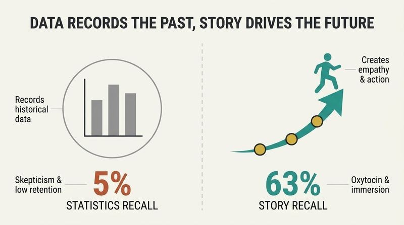
Numbers are inert until narrated. Duarte's central claim is that data, no matter how rich, almost never communicates clearly on its own. It catalogs what already happened, but decisions are about a future nobody has data for yet. Someone must give the numbers a voice.
Stories beat statistics for memory. She cites Chip Heath's Stanford experiment: students gave one-minute persuasion speeches averaging 2.5 statistics each, and only one in ten told a story. When asked to recall the speeches afterward, just 5% remembered a specific statistic, but 63% remembered the stories. The reason is neurological: stories light up language, sensory, and emotional regions of the brain, releasing oxytocin (empathy) and cortisol (attention). Analytical processing invites skepticism; narrative invites immersion. So the job is not prettier charts but numbers wrapped in narrative structure.
The claim rests on solid ground. Paul Zak's neuroeconomics work, which Duarte references, showed that character-driven stories with tension measurably raise oxytocin and predict later charitable giving. Yet a caveat deserves airtime: the same machinery that makes stories memorable makes them manipulable. A vivid anecdote can override a statistically representative truth, a bias psychologists call the identifiable victim effect. Duarte's own guardrail matters here: get the truth out of the data first, then dramatize only the action. Storytelling should be the delivery vehicle for verified findings, never a substitute for the analysis itself. Persuasion and honesty are not automatically aligned.
The scarce skill isn't crunching data, it's explaining it
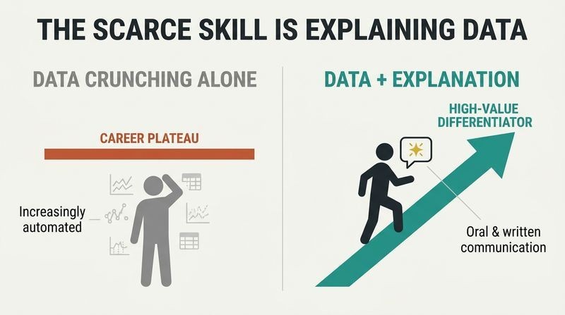
Analysis is where careers plateau. Duarte argues that as machine learning grows smarter, roles limited to exploring data become vulnerable, while the ability to explain findings and recommend action becomes the differentiator. LinkedIn's 2018 skills-gap study, cited by CEO Jeff Weiner, found the number one gap in the workforce was soft skills: of a 1.6 million shortfall, roughly 993,000 openings needed oral communication and 140,000 needed writing.
Employers want data people who can write. Burning Glass research for IBM found data-science jobs demand soft skills more than almost any other role, prizing problem-solving, writing, and creativity. These aptitudes are cultivated in the liberal arts, not statistics courses. PwC found 67% of job openings are analytics-enabled. The upshot: comfort with data plus the ability to make a persuasive, structured case is the rare, well-compensated combination.
This reframes a familiar anxiety. The cultural story of the 2010s was learn to code and master data. Duarte flips it: the bottleneck has migrated downstream, from generating insight to transmitting it. There is genuine economic logic here, echoing David Autor's research on labor polarization, which shows that tasks resisting automation are those requiring judgment, persuasion, and interpersonal nuance. One caution: framing communication as a soft skill undersells it. Translating multivariate uncertainty into a defensible recommendation is cognitively demanding work. The label soft obscures how hard, and how learnable, it actually is.
Position yourself as the mentor who hands leaders the magic tool
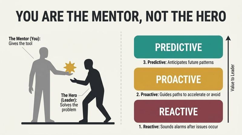
You are Obi-Wan, not Luke. Duarte reframes the data communicator's role using the mentor archetype. In stories, the mentor gives the hero exactly what they need at the critical moment, like Obi-Wan handing Luke a lightsaber. Your data is that tool, and the decision-maker is the hero on the journey. Deliver the right insight in the nick of time and you change the outcome.
Three modes of mentorship with data:
1. Reactive: sound an alarm after data reveals a problem.
2. Proactive: use data to accelerate or avoid something before it happens.
3. Predictive: spot patterns to anticipate what's coming next.
Those who master this become trusted go-to advisors invited into higher-stakes decisions. The posture matters: you serve the decision-maker's quest rather than showcasing your own analytical brilliance.
Casting the executive as hero and the analyst as mentor is shrewd organizational psychology. It resolves a common tension: analysts crave credit for insight, but decision-makers resent being lectured. By adopting the mentor frame, the communicator gains influence precisely by ceding the spotlight, an idea that rhymes with Robert Greene's counsel to let superiors feel smarter. It also maps onto Joseph Campbell's monomyth, where the mentor rarely completes the journey personally. The subtle risk is self-erasure: perpetual mentors can be taken for granted. The savviest practitioners make their fingerprints on good decisions quietly visible, so that reputational capital compounds over time.
Executives interrupt fast, so prepare 15 minutes for a 30-minute slot
Time is an executive's scarcest asset. Duarte stresses tailoring not just content but format to how leaders actually consume information. The higher the authority, the briefer and more structured your case must be. She profiles disciplined routines: Tim Cook rising at 4:30 a.m., Indra Nooyi delegating parental permissions to an assistant, Richard Branson scheduling family time in his work calendar.
Expect to be grilled mid-sentence. Executives interrupt not out of rudeness but because they assess and challenge information quickly. The moment they grasp your core idea, they form a mental picture with gaps and fire questions to fill them. So if given 30 minutes, prepare only 15 and leave room for interrogation. Find a sponsor who knows the executive's strong opinions, likely counterarguments, and preferred format (some read every word, others want five slides). Match their style, not yours.
The advice inverts the amateur's instinct to fill every minute with slides. Underloading the agenda signals confidence and respect for the listener's tempo. This aligns with research on cognitive load and expert decision-making: seasoned executives use rapid pattern-matching, what Gary Klein calls recognition-primed decision-making, so they need answers to their own emerging questions more than a linear walkthrough. The sponsor tactic is essentially organizational reconnaissance, reducing uncertainty about a specific audience of one. A limitation: not every culture rewards brevity equally. In some engineering-heavy or highly regulated firms, depth and exhaustive backup are the currency of credibility, so calibration still matters.
Compress your whole recommendation into one sentence with one clear verb
The DataPOV is your thesis. Duarte's core building block is the DataPOV, short for Data Point of View, structured as a Big Idea with two parts: a unique point of view that requires action, and a clear statement of what's at stake if it is or isn't approved. Write it as one complete sentence (at least one noun, one verb). It becomes your title page. If no action is needed, there is no recommendation.
The verb carries the weight. Duarte, who once built a life mission statement around its verb, groups action verbs into three modalities: Change, Continue, or Finish. She also splits performance verbs (measured in numbers over time, like increase or reduce) from process verbs (binary, done or not, like build or launch). For executives, favor performance verbs, because they map directly to the levers leaders are measured on.
Forcing an entire analysis into a single actionable sentence is a discipline borrowed from journalism's nut graf and consulting's answer-first pyramid, notably Barbara Minto's Pyramid Principle. The verb obsession is the fresh contribution. Cognitive linguistics supports it: verbs encode agency and causality, so a weak or vague verb (explore, consider) quietly signals a weak recommendation. The performance-versus-process distinction is a practical heuristic for calibrating ambition to audience. One tension worth naming: demanding a point of view that requires action can pressure analysts toward false certainty. Duarte's insistence that intuition follows, never replaces, verified data is the essential brake on that pressure.
Frame your executive summary as three acts with a messy middle
Borrow Aristotle's arc for business. Duarte maps the classic three-act dramatic structure onto the executive summary, calling the result a DataStory. Act 1 establishes the situation: data reveals a problem or opportunity. Act 2 is the messy middle, the conflict, where specific metrics must change (reverse, increase, reduce, speed up). Act 3 is your DataPOV, the resolution showing how the numbers turn around once action is taken.
Conflict is where humans live. She likens the middle to Frodo's gauntlet of Orcs and Gollum, or Pinocchio's temptations. Organizations are equally messy: broken processes, unhappy customers, aggressive competitors. Most business data moves because of human behavior, so the messy middle names the measurable symptom people must reverse. Conjunctions (and, but, so, therefore) stitch the three acts into a flowing narrative rather than a static list of findings.
Applying dramatic structure to a memo is more than a gimmick; it exploits how the mind encodes causal sequences. Narrative comprehension research (Kintsch, Zwaan) shows readers build situation models, tracking goals, obstacles, and outcomes, which is exactly the beginning-conflict-resolution shape. The messy middle deserves emphasis because it is where honesty resides: naming what is genuinely hard prevents the sugarcoated recommendation that executives distrust. A subtle risk is imposing narrative tidiness on messy reality, manufacturing a clean villain or a guaranteed happy ending. The strongest DataStories keep the resolution conditional, honestly flagging that the turnaround depends on people actually acting.
Build a Recommendation Tree and pressure-test it as your own harshest critic
One idea per slide, all hanging from the DataPOV. Duarte's Recommendation Tree is a hierarchy: the DataPOV sits at the top, and every supporting point (often three, for memorability) cascades below it. Built in slide software as a Slidedoc, each slide is a node. The structure filters out tangents and blends logical appeal (proving you're right) with persuasive appeal (moving people to act).
Answer three questions and attack yourself. Each slide should address What (the action verb), Why (the reason it matters), and How (the process). Duarte warns against skipping Why, the most common mistake. Then play skeptic: anticipate how peers, bosses, and customers will resist, and include counterarguments so the audience sees you considered them. State business assumptions transparently as This is true if, such as if revenue keeps growing at 2.5% or no new competitor appears, since every forecast rests on educated guesswork.
The tree is Minto's Pyramid Principle rendered visually, and the What-Why-How triad guards against the analyst's chronic omission: leaping to recommendations without motivating them. The most intellectually honest move here is deliberate self-skepticism. This is a structured antidote to confirmation bias, echoing Charlie Munger's dictum that you don't truly understand a position until you can argue the opposing side better than your opponents. The This is true if convention is quietly radical in corporate settings, where hidden assumptions usually masquerade as facts. Surfacing them converts a brittle prediction into a falsifiable, defensible one, and paradoxically builds more trust than false confidence ever could.
Explain with boring charts; save the dazzling visualizations for exploring
Clarity outperforms cool. With gorgeous business-intelligence tools everywhere, Duarte's counsel is deliberately unglamorous: to gain agreement on action, use the three charts everyone instantly understands. A bar chart measures quantity, a pie chart measures parts of a whole, and a line chart measures change over time. Complex visualizations add mental labor, bury the insight, and can look so authoritative that people suspend judgment. Use fancy tools to explore, then translate findings into simple form to explain.
Titles neutral, observations pointed. Chart titles should be factual (2019 Monthly Profit by Percentage), never a conclusion. The insight goes in a separate observation. Her grammar-based trick: describe static bar and pie charts with adjectives (largest, greater, majority) and describe line-chart trends with adverbs and verbs (climbing steadily, plummeting sharply), because a trend line is essentially a verb.
The insight that authoritative-looking charts suppress scrutiny is underappreciated and empirically grounded. Studies on graph rhetoric show that visual complexity and even superfluous 3D effects can increase persuasion while decreasing comprehension, precisely the wrong trade for honest communication. Duarte's grammar mapping (adjectives for static magnitudes, adverbs for temporal change) is an unusually concrete teaching device that forces the communicator to articulate what the chart actually shows. The one place reasonable experts push back is domain expertise: for audiences fluent in a field's native visual language, such as candlestick charts in finance, insisting on simplicity can feel condescending. Duarte grants this exception; know your room.
Anchor incomprehensible numbers to something the body can feel
Big numbers are meaningless until compared. Humans cannot intuit a billion or a trillion, so Duarte urges tethering data to relatable size, distance, time, or speed. When Jeff Bezos's wealth made news, Neil deGrasse Tyson said $130 billion laid end to end could circle Earth 200 times, but Duarte notes that even the Moon (238,000 miles) is hard to picture. Better: those stacked dollars are 8,822 miles, or driving across the US 3.4 times. Forbes made his earnings vivid as $1,243 per second.
Precision is not the point here. For magnitude, approximate comparisons win. A million users fills a 41,915-seat baseball stadium nearly 24 times. Steve Jobs never quoted the iPod's megabytes; he slid it from his pocket and said it holds a thousand songs. Weight and microscopic scale resist intuition, so convert them into things people can see.
This is applied psychophysics. The Weber-Fechner law describes how human perception of magnitude is logarithmic, not linear, which is exactly why raw large numbers fail and ratio-based comparisons succeed. Duarte's stadium and pocket examples work because they recruit embodied cognition: understanding grounded in bodily and spatial experience, a line of research advanced by Lakoff and Johnson. Jobs pulling the device from his pocket is a masterclass in making an abstract spec physically legible. A gentle warning accompanies the technique: comparisons can smuggle in emotional framing. Circling the Earth 200 times editorializes about excess. Choosing the comparison is choosing the message, so choose with integrity.
Every data point hides a hero and an adversary; go interview them
Data is people in disguise. Most organizational data exists because humans generated it by buying, clicking, quitting, or getting sick. Duarte urges treating those people as characters, either heroes helping you reach a goal or adversaries pushing numbers the wrong way. She borrows five classic conflict types (hero versus self, person, society, technology, or nature) to diagnose what's really blocking progress. If upgrades stall, the customer Fran may face her carrier (versus company), a clunky reservation flow (versus technology), or her own hesitation (versus self), each needing a different response.
Talk to the humans behind the chart. Numbers show what happened, rarely why. Read forums, run surveys, and have real two-way conversations, asking open questions like what's stopping you rather than leading ones. Dr. Rosalind Picard's seizure-detecting smartwatch emerged only because she phoned a student to ask what happened before a data spike.
The conflict typology is a clever import from creative writing into analytics, and it does real diagnostic work by forcing specificity about causation. The deeper methodological point is that quantitative data is necessary but insufficient; it detects correlation and magnitude but is mute on mechanism. Mixed-methods researchers have argued this for decades: qualitative inquiry recovers the why that regression cannot. Picard's anecdote illustrates the humbling truth that the most important variable often lives outside the dataset entirely, discoverable only by asking. The framing also carries an ethical charge: remembering that a churn statistic is a frustrated human keeps optimization honest, resisting the temptation to treat people as metrics to be gamed.
Withhold the outcome to turn a data reveal into suspense
Suspense beats surprise, per Hitchcock. When presenting live, Duarte says reveal data over time rather than dumping the conclusion. Hitchcock's bomb analogy captures why: a bomb that explodes with no warning gives 15 seconds of surprise, but a bomb the audience knows about ticking under the table gives 15 minutes of suspense. Reveal bars one at a time, or hide part of an axis, and the audience leans in until resolution.
Data follows the shapes of stories. Novelist Kurt Vonnegut argued stories have simple plottable arcs (Man in a Hole, Boy Gets Girl, Cinderella), and University of Vermont researchers confirmed it by sentiment-analyzing 1,327 books, finding six emotional arcs. Al Gore rode a scissor lift up a hidden 90-foot screen to show soaring CO2, a moment Duarte calls a STAR moment, Something They'll Always Remember. Charity: Water's Scott Harrison staged a Cinderella arc, revealing a growth collapse before a triumphant rebound to 1.2 million people served.
The suspense principle exploits a well-documented quirk: the Zeigarnik effect, our compulsion to resolve unfinished sequences. Progressive disclosure keeps that loop open, sustaining attention that a spoiler would collapse. The Vonnegut-to-computation arc is a satisfying case of intuition later validated by data science, though the six-arcs finding drew methodological critique for how sentiment analysis flattens meaning. The genuine caution is theatrical restraint. Duarte insists the STAR moment must fit the presentation's tone or it curdles into a cheesy stunt. There is also an ethics of pacing: engineering a Cinderella rebound is honest when the recovery is real, but manufacturing false suspense around foregone conclusions erodes the trust these techniques are meant to build.
Analysis
DataStory occupies a specific and underserved niche: the last mile between analysis and action. Where most data literature obsesses over collection, modeling, and visualization, Duarte fixes her attention on the moment a human must convince another human to do something. Her thesis, that data is inert until narrated, is not new (the Heaths, Cole Nussbaumer Knaflic, and Scott Berinato share the territory), but her contribution is unusually operational. She reverse-engineered thousands of real corporate slides, cataloging their vocabulary, and turned the findings into teachable mechanics: verb modalities, adjective-versus-adverb chart observations, the This is true if assumption convention, and the What-Why-How slide triad.
The book's intellectual signature is its fusion of Aristotelian dramaturgy with consulting rigor. The three-act DataStory and the Recommendation Tree are, respectively, Freytag's pyramid and Minto's pyramid wearing corporate attire. This synthesis is genuinely useful because it addresses both hemispheres of persuasion: logic to be right, story to be felt. Duarte is careful, more than critics might expect, to firewall the two. Creativity and intuition apply only after the truth is verified in the data, never to bend the data itself.
The work's limitations are mostly limitations of scope. It is optimized for one context: an ambitious individual pitching a recommendation upward to busy executives inside a company. Its advice on brevity, interruption, and performance verbs is finely tuned to that audience and transfers imperfectly to public-facing communication, scientific reporting, or cultures that reward exhaustive documentation. The heavy reliance on Steve Jobs and blockbuster-movie exemplars occasionally conflates showmanship with substance. And the persuasion toolkit, powerful as it is, sits perpetually one step from manipulation; the same suspense and comparison techniques that clarify can also mislead. Duarte's ethical guardrails are present but understated. Read as a craft manual for the analyst who wants influence rather than obscurity, it is precise, practical, and quietly ambitious about reshaping how organizations decide.
Review Summary
DataStory receives mostly positive reviews for its insights on data presentation and storytelling. Readers appreciate the practical advice, examples, and visual design. Many find it useful for improving presentations and communicating data effectively. Some criticize it for being too basic or sales-oriented. The book is praised for its frameworks, particularly the three-act structure for data stories. While some experienced professionals find it elementary, others see it as a valuable reference guide for data visualization and storytelling techniques.
People Also Read





FAQ
What's "DataStory: Explain Data and Inspire Action Through Story" about?
- Combining Data and Storytelling: "DataStory" by Nancy Duarte focuses on the integration of storytelling techniques with data presentation to inspire action and lead effectively.
- Structure and Communication: The book provides a framework for structuring data into a narrative that is engaging and memorable, using a three-act story structure.
- Empathy and Connection: It emphasizes the importance of empathy in communication, ensuring that data is presented in a way that resonates with the audience.
- Practical Techniques: The book offers practical advice on crafting executive summaries, choosing the right charts, and making data visually consumable.
Why should I read "DataStory"?
- Enhance Communication Skills: The book is essential for anyone looking to improve their ability to communicate data effectively and persuasively.
- Leadership Development: It is particularly useful for those in leadership roles who need to make data-driven decisions and inspire their teams.
- Actionable Insights: "DataStory" provides actionable insights and techniques that can be applied immediately to improve data presentations.
- Empathy-Based Approach: The book's focus on empathy ensures that data is not just presented but is also understood and acted upon by the audience.
What are the key takeaways of "DataStory"?
- Story Structure: Use a three-act story structure to make data presentations more engaging and memorable.
- Empathy in Communication: Tailor your message to the audience's needs and background to ensure clarity and understanding.
- Visual Clarity: Choose simple, familiar charts and use annotations to highlight key insights without overwhelming the audience.
- Action-Oriented Data: Formulate a clear Data Point of View (DataPOV) that includes a recommended action and the stakes involved.
How does Nancy Duarte suggest transforming numbers into narratives?
- Identify the Story: Recognize the story emerging from the data, as data alone does not speak for itself.
- Engage the Audience: Use vivid scenes and a structured delivery to make the audience care about the data.
- Memorability: Stories are more memorable than statistics; use storytelling to activate emotions and improve recall.
- Avoid Fiction: While using storytelling techniques, avoid incorporating creative fiction into data presentations.
What is the Data Point of View (DataPOV) in "DataStory"?
- Definition: A DataPOV is a structured statement that combines a unique point of view with a required action based on data insights.
- Structure: It should be a complete sentence that clearly states the action to be taken and what is at stake.
- Central Role: The DataPOV serves as the centerpiece of the entire recommendation, guiding the narrative and supporting evidence.
- Clarity and Ownership: It requires the communicator to own their perspective and articulate it clearly to drive action.
How does "DataStory" recommend structuring an executive summary?
- Three-Act Structure: Use a beginning, middle, and end to structure the executive summary as a DataStory.
- Act 1 - Situation: Introduce the current situation and the problem or opportunity identified in the data.
- Act 2 - Conflict: Highlight the messy middle, where data presents problems or opportunities that need addressing.
- Act 3 - Resolution: Conclude with the DataPOV, proposing a solution and the positive outcomes of taking action.
What are the best quotes from "DataStory" and what do they mean?
- "Oh, the stories data would tell, if there were a teller to tell them well." This quote emphasizes the importance of a skilled communicator to bring data to life through storytelling.
- "Action is the foundational key to all success." This quote by Pablo Picasso, included in the book, underscores the importance of taking action based on data insights.
- "Tell me the facts, and I’ll learn. Tell me the truth, and I’ll believe. But tell me a story, and it will live in my heart forever." This Native American proverb highlights the lasting impact of storytelling compared to mere facts or truths.
- "Good design is good business." This quote by Thomas Watson, Jr. reinforces the idea that clear and effective communication, including data presentation, is crucial for business success.
How does "DataStory" suggest choosing charts and writing observations?
- Simple Charts: Use bar, pie, and line charts that are familiar and easy for everyone to understand.
- Clear Titles: Write factual and neutral chart titles that convey what, how, and when the measurement happened.
- Descriptive Observations: Add observations to charts using adjectives for static data and adverbs for trends to highlight key insights.
- Visual Annotations: Use visual elements like highlights, labels, and brackets to make data points stand out and add clarity.
What is a Slidedoc™ according to "DataStory"?
- Definition: A Slidedoc is a visual document designed for quick consumption, combining the strengths of a document with the advantages of visualization.
- Purpose: It is intended to be read and distributed rather than presented, making it ideal for conveying detailed information concisely.
- Structure: Slidedocs should be modular, with one idea per slide, allowing for easy skimming and comprehension.
- Distribution: They are effective for spreading ideas within an organization, as they can be easily shared and adapted.
How does "DataStory" recommend making data stick?
- Relatable Comparisons: Attach data to something relatable, such as size, time, or familiar objects, to help the audience understand magnitude.
- Humanize Data: Identify the heroes and adversaries in the data to create a narrative that resonates with the audience.
- Emotional Connection: Use storytelling techniques to evoke emotions and make data memorable and actionable.
- Contextual Meaning: Provide context to data points to add meaning and make them more relevant to the audience.
What role does empathy play in "DataStory"?
- Foundation of Communication: Empathy is the foundation of effective communication, ensuring that the message is tailored to the audience's needs.
- Understanding the Audience: Recognize the different backgrounds and knowledge levels of the audience to present data clearly and effectively.
- Building Connection: Empathy helps build a connection between the storyteller and the audience, making the data more engaging and persuasive.
- Driving Action: By understanding the audience's perspective, communicators can craft messages that inspire action and drive change.
How does "DataStory" address communicating to decision-makers?
- Know Your Audience: Tailor the approach to the decision-maker's preferences and authority level, using structured and brief communication.
- Respect Their Time: Executives are busy, so recommendations should be concise, logical, and easily skimmable.
- Anticipate Questions: Be prepared for interruptions and questions, as executives will challenge information to gain clarity.
- Understand Their Measures: Recommendations should align with executive performance levers, such as growth, efficiency, and innovation, to ensure relevance and approval.
About the Author


Download PDF
Download EPUB
.epub digital book format is ideal for reading ebooks on phones, tablets, and e-readers.